Rankevra Blog
SEO Reporting Dashboard: What to Include and How to Build It
July 28, 2026
What an SEO Reporting Dashboard Actually Is (and Isn't)
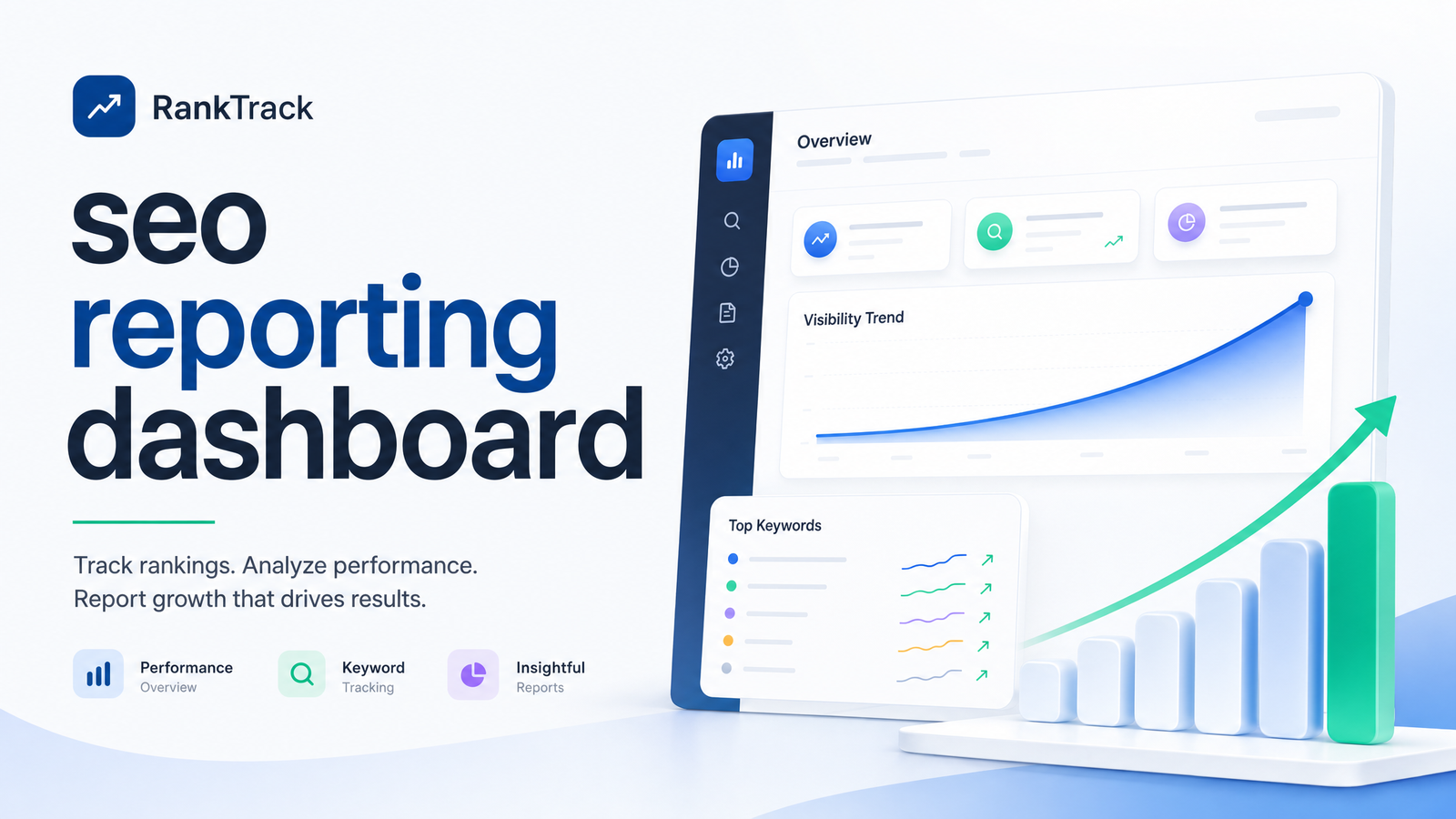
An SEO reporting dashboard is a live, continuously updated view of the metrics that show whether your organic search performance is improving. It is not a static spreadsheet, a monthly PDF, or a one-off export from Google Search Console. That distinction — seo report vs dashboard — matters more than most teams treat it.
A report is a snapshot, assembled by hand and already stale by the time someone reads it. A dashboard is a system: data flows in continuously, so the numbers reflect what's happening now. The report tells you what happened last month. The dashboard tells you what's happening and, when built well, why.
The core failure most teams run into isn't a lack of data — it's an excess of it without context. Impressions dropped 12%. Is that seasonal, a ranking loss, a Google update, or a technical issue that broke indexing on part of the site? A raw metric dump can't answer that. A properly structured seo reporting dashboard pairs the number with the event that likely caused it, so the person looking at it can decide what to do next. That's the entire point of building one — not to display data, but to drive action.
The Metrics That Actually Belong on Your Dashboard
The instinct is to track everything. Resist it. A dashboard with twenty seo dashboard metrics is functionally the same as no dashboard — nobody scans twenty numbers and finds the signal. Aim for a core seo kpi dashboard of five metrics, each earning its place because it answers a specific question.
Organic traffic trend. The clearest indicator of whether your SEO work is compounding. Look at it as a trend line, not a monthly total — a single number tells you nothing about direction.
Keyword rankings and visibility. Rankings are the leading indicator; traffic is the lagging one. Tracking visibility across your priority keyword set shows where movement is coming before it shows up in traffic numbers.
Impressions, click-through rate, and average position. Pulled straight from Search Console, this trio tells you whether you have a visibility problem (low impressions), a relevance/snippet problem (low CTR despite decent position), or both.
Technical health score. A rollup of crawl errors, broken links, Core Web Vitals, and indexation issues. Traffic and rankings can decay for months before anyone notices the technical cause without this metric sitting next to them.
Conversions. Traffic that doesn't convert isn't a business win, it's a vanity metric. Even a rough proxy — form fills, signups, revenue-attributed sessions — keeps the dashboard honest about outcomes rather than activity.
Backlinks (optional sixth). Worth including if authority-building is active in your strategy; skip it if link acquisition isn't currently a lever you're pulling.
Notice what's missing: no bounce rate, no session duration, no vanity "total keywords tracked" counter. Every metric above answers a specific question about growth, health, or return. If a number doesn't, it doesn't belong on the dashboard — put it in an appendix if you must keep it.
Build the Dashboard in Layers, Not One Flat View
The most common mistake in dashboard design isn't picking the wrong metrics — it's showing the same view to everyone. An executive, a marketer, and a technical lead need different information, and forcing them into one flat report guarantees most of them ignore it.
An executive layer should hold three or four numbers, maximum: organic traffic trend, conversions, and a one-line health status. No jargon, no crawl-error counts — just "is this working and is it worth the investment."
A marketer layer goes deeper: rankings by keyword cluster, impressions and CTR trends, content performance by page, and enough context to decide what to write, update, or promote next.
A technical layer surfaces crawl errors, Core Web Vitals scores, indexation status, and site health trends over time — the detail a developer or technical SEO needs to prioritize fixes.
This layering approach is exactly what a well-built client seo dashboard needs too: agencies reporting to clients face the same problem internally, just with an added trust dimension. A client wants the executive view with enough marketer-level detail to see the "why" behind the numbers, not a raw data export. Structuring your seo dashboard for stakeholders this way — rather than one master view everyone squints at — is what separates a dashboard people actually check from one that gets built once and ignored.
How to Set One Up: A 5-Step Workflow
Here's a practical sequence for how to build an seo dashboard, whether you're doing it manually or evaluating automated seo reporting tools to do it for you.
1. Pick your data sources. At minimum: Google Search Console for impressions/clicks/CTR/position, Google Analytics 4 for traffic and conversions, a rank tracker for keyword-level visibility, and a technical audit tool for site health. If you're still deciding on rank tracking specifically, this rank tracker buying guide walks through what to look for.
2. Define the core KPI set before touching a tool. Lock in your five (or six) metrics from the section above. Deciding this after you've started pulling data leads to scope creep and a bloated dashboard.
3. Set an update cadence. Weekly for rankings and technical alerts, monthly for the trend-level executive view. A dashboard that updates constantly but is never reviewed is as useless as one that's stale.
4. Layer by audience. Build the executive, marketer, and technical views as described above, ideally from the same underlying data rather than three separate manual processes.
5. Add annotations and context. Every meaningful change — a Google algorithm update, a site migration, a content push, a technical fix — should be logged against the timeline. Without this, six months from now nobody will remember why traffic jumped in March.
If your dashboard needs a companion audit document rather than just live data, a structured audit report template is worth pairing with the technical layer.
Where Manual Dashboards Break Down
This workflow is straightforward on paper. In practice, most teams build it once in a spreadsheet, feel good about it for a month, then watch it quietly die. Here's the specific failure mode: rankings live in one app, traffic lives in GSC and GA4, technical issues live in a separate audit tool, and someone is manually exporting all three into a spreadsheet every week or month to stitch together a view.
This breaks down in predictable ways. Exports go stale the moment they're pulled — the "dashboard" is really a photograph of last Tuesday. Manual copy-paste introduces errors: mismatched date ranges, wrong keyword sets, formulas that silently break when a column shifts. And because it takes hours each cycle, it gets deprioritized the moment anything urgent comes up, which is exactly when stakeholders most need current numbers.
The deeper problem with manual seo reporting isn't the time cost, though that's real — it's that disconnected tools can't show causation. Rankings dropping in one app tells you nothing about whether a Core Web Vitals issue flagged in a different tool is the cause. You have to hold that connection in your head and remember to check both. Most weeks, nobody does. This is the exact gap purpose-built seo reporting tools are designed to close, and it's worth evaluating options against a clear framework rather than picking whatever's cheapest — this buyer's framework covers what actually matters when comparing them.
Automating the Dashboard with Rankevra
Rankevra was built around this exact gap. Instead of exporting rankings from one tool, traffic from GSC, and issues from an audit tool into a spreadsheet, Rankevra runs audits, tracks rankings, and manages content publishing inside one system — so the dashboard it generates is assembled from connected data, not stitched-together exports.
That connection is what makes automated seo reporting genuinely different from a faster spreadsheet. When a technical issue drags down Core Web Vitals, Rankevra's dashboard can surface that alongside the ranking dip it's affecting, in the same view, without you cross-referencing two tools by hand. When a content update ships, the ranking and traffic response shows up against the same timeline — the annotation problem from Step 5 solves itself because the platform already knows what changed and when.
Because it updates continuously rather than on export day, the seo reporting software layer stays current between the moments someone actually looks at it, and the layered views — executive summary, marketer detail, technical health — are generated from the same underlying data rather than rebuilt separately each time. For teams trying to grow organic traffic while fixing technical debt and building topical authority simultaneously, that single live view of cause and effect is the practical difference between a dashboard people check weekly and one that gets built once and forgotten. If you want more background on the traffic-growth side specifically, this guide to what's actually driving organic growth is a useful companion. And if Search Console is still your primary data source, these GSC tips are worth applying regardless of which dashboard tool you land on.
Instead of rebuilding your spreadsheet next month, see what a live dashboard looks like when it's built from connected data instead of manual exports — Rankevra puts audits, rankings, and content performance in one place automatically.
Frequently Asked Questions
What's the difference between an SEO dashboard and a regular SEO report?
A report is a static snapshot — usually a spreadsheet or PDF built at a point in time and outdated as soon as anything changes. A dashboard is a live system that updates continuously as new data comes in from Search Console, analytics, rank tracking, and audit tools, so it reflects current performance rather than last month's numbers.
What metrics should be on an SEO reporting dashboard for a client vs. an internal team?
Client-facing dashboards should lead with outcomes — organic traffic trend, conversions, and a plain-language health status — with enough supporting detail to explain "why" without overwhelming them. Internal teams need the deeper layer underneath: keyword-level rankings, impressions/CTR/position by page, and technical health details that inform day-to-day decisions.
How often should an SEO reporting dashboard be updated?
Rankings and technical alerts are worth checking weekly, since issues compound quickly if missed. Trend-level views for stakeholders are typically reviewed monthly, though the underlying data should update continuously rather than only on report day.
Can I build an SEO reporting dashboard for free with Google Search Console and Sheets?
Yes, for a basic version — GSC exports impressions, clicks, CTR, and position data that can be charted in Sheets. It breaks down as a long-term solution because it requires manual exports on a schedule, doesn't merge in rank tracking or technical audit data automatically, and goes stale the moment nobody updates it.
How many metrics should actually be on an SEO dashboard?
Five is a reasonable ceiling for a core view: organic traffic trend, keyword rankings/visibility, impressions/CTR/position, technical health score, and conversions, with backlinks as an optional sixth. More than that dilutes attention and makes it harder to spot what actually changed.
Does an SEO reporting dashboard need to include technical SEO issues, or just traffic and rankings?
Technical health belongs on the dashboard, not just traffic and rankings, because it's often the underlying cause of movement in the other two. Without a technical health score visible alongside traffic and rankings, teams can spend weeks chasing a content explanation for a problem that's actually a crawl or Core Web Vitals issue.
Keep reading
- Programmatic SEO: How to Scale Pages Without GettingProgrammatic SEO explained: how it works, real examples, and the line between pages that rank and ones Google flags for scaled content abuse.
- Does Core Web Vitals Affect SEO? The Direct AnswerDoes Core Web Vitals affect SEO? Yes—but as a tiebreaker, not a dominant factor. Here's what Google confirms, what INP changed, and how to check your scores.
- SEO-Friendly Content Generator: A Buyer's FrameworkWhat actually makes an SEO friendly content generator work: E-E-A-T, intent match, and a 5-part checklist to vet output before you publish.