Rankevra Blog
Mobile-First Indexing Checklist for 2026
July 25, 2026
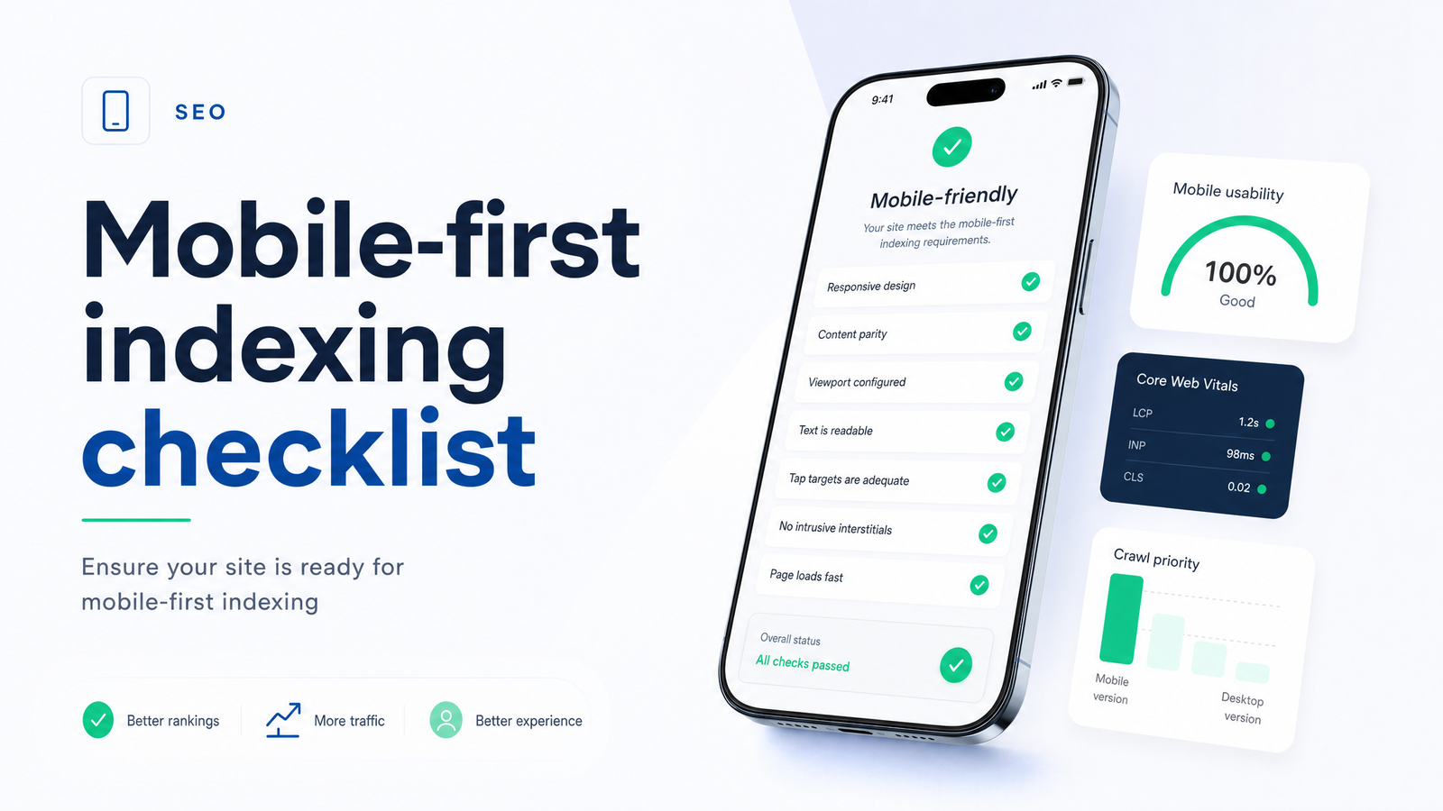
Mobile-First Indexing in 2026: What's Actually Being Checked
Google finished migrating virtually all sites to mobile-first indexing back in 2024 — Googlebot Smartphone is now the default crawler and renderer for ranking purposes. So the question in 2026 isn't "does mobile-first indexing apply to me?" It's whether your mobile pages quietly drifted away from your desktop content without anyone noticing. That drift — not the transition itself — is what actually costs sites rankings today.
The failure mode has changed. It used to be about missing viewport tags and unusable tap targets. Now it's about silent parity gaps: a redesign that trims mobile copy, a plugin update that drops schema on smaller viewports, a lazy-load implementation that hides text from the crawler. None of these trigger an alert. They just show up months later as a slow ranking decline nobody can explain.
The Mobile-First Indexing Checklist
Treat this as a working mobile SEO checklist you run on a schedule, not a one-time launch task. Each category below includes a fast self-check you can do manually on a handful of pages before deciding whether to audit the whole site.
1. Content Parity: Does Your Mobile Page Say the Same Thing?
Google indexes what's in the mobile HTML — if your mobile template truncates a product description, drops an FAQ section, or removes supporting paragraphs to save screen space, that content effectively doesn't exist for ranking purposes anymore, even though it's still live on desktop.
Self-check: Open the same URL on desktop and on a real mobile device (or Chrome's device toolbar). Compare word count, heading structure (H1–H3), and any sections like specs tables, author bios, or related-content blocks. If something is present on desktop and absent on mobile, that's a parity gap — not a design choice.
2. Internal Links and Navigation Parity
Mobile internal links often get pruned to keep the mobile nav "clean" — secondary menu items, footer link blocks, and in-content links to related pages sometimes only exist in the desktop template. Since Googlebot Smartphone follows the mobile version to discover new pages and pass link equity, any link that exists only on desktop is invisible to the crawl path Google actually uses.
Self-check: Count outbound links (nav, footer, in-body) on the mobile render versus desktop. Pay attention to mega-menus that collapse into a hamburger menu with fewer entries, and footer link farms stripped down to "essentials" on small screens.
3. Structured Data and Metadata Match
Titles, meta descriptions, and schema markup must be identical on mobile and desktop — not just present in some reduced form. It's common for a mobile theme or AMP-adjacent template to drop JSON-LD entirely, or for a caching layer to serve a stripped-down <head> on mobile. For the full picture of what schema does for rankings and how mismatches get flagged, see Structured Data for SEO: What It Really Does in 2026.
Self-check: Run both the mobile and desktop URLs through a schema validator and diff the output. Also compare canonical tags — mobile and desktop versions should point to the same canonical URL; if you're running separate m-dot URLs, cross-check against the guidance in Canonical Tags & Duplicate Content: A Diagnostic Guide.
4. Crawlability: Can Googlebot Smartphone Reach Everything?
Mobile crawlability breaks in ways desktop crawls never surface. Common culprits: robots.txt rules that block a mobile-specific JS bundle or image CDN path, lazy-loaded content that only fires on scroll events the crawler doesn't simulate, and infinite-scroll pagination with no crawlable link to subsequent pages. Any of these can leave real content technically on the page but functionally invisible to Googlebot Smartphone. For a deeper diagnostic walkthrough, see Googlebot Search: What It Is and How to Diagnose Crawl.
Self-check: Use the URL Inspection tool's rendered HTML and screenshot to confirm lazy-loaded sections actually appear. Check robots.txt for any disallow rule scoped to asset paths your mobile template depends on but desktop doesn't.
5. Mobile Page Experience and Core Web Vitals
Mobile Core Web Vitals — LCP, INP, and CLS — are measured on real mobile traffic and weighted more heavily than most site owners assume, since mobile devices and connections are typically slower and less stable than desktop. A page that comfortably passes on desktop can fail on mobile due to render-blocking scripts, unoptimized images, or layout shifts from late-loading ads. The full threshold breakdown and fix priorities live in Core Web Vitals Optimization: What Matters in 2026.
6. Viewport, Tap Targets, and Intrusive Interstitials
These are the older, more mechanical checks — still worth confirming because CMS updates can silently break them. Confirm the viewport meta tag is present and correctly configured (width=device-width, initial-scale=1), that tap targets have enough spacing to avoid mis-taps, and that no interstitial — a cookie banner, newsletter pop-up, or app-install prompt — covers the main content on load. Google has flagged intrusive interstitials as a mobile usability issue for years; a resurfacing pop-up plugin is a common, easy-to-miss regression.
How to Verify Which Version Google Actually Indexed
Don't assume — confirm. "Mobile-friendly" is a per-page rendering test; "mobile-first indexed" is about which version Google treats as ground truth for ranking. The two are frequently conflated, and a page can pass a mobile-friendliness test while still having parity gaps that hurt it in mobile-first indexing.
The fastest way to verify mobile-first indexing status is Search Console's URL Inspection tool. Inspect the live URL, then look at the "Crawled as" field — it should say Googlebot Smartphone. The rendered screenshot and HTML shown there reflect exactly what Google saw, which is the fastest way to catch a stripped-down mobile render before it shows up as a ranking drop. Cross-reference this with Crawl Stats in Search Console, which breaks down requests by user agent (Smartphone vs. Desktop) — if desktop crawl requests dominate long after your migration, that's worth investigating. John Mueller and the Google Search Central team have repeatedly pointed to URL Inspection as the authoritative source of truth here, over any third-party mobile-friendly test.
For a broader view of what else to check beyond mobile specifically, the On-Page SEO Audit Checklist: 7 Categories That Matter and How to Conduct a Technical SEO Site Audit (2026 Guide) cover the full technical picture this mobile checklist sits inside.
Why This Checklist Breaks Quietly (and How to Stop Re-Running It Manually)
None of these failures require a deliberate decision to break something. A theme update rolls out a new accordion component for mobile FAQs, and the content inside collapses out of the initial HTML render. A new plugin adds a "simplified mobile menu" that quietly drops eight internal links. A CDN caching rule gets misconfigured and starts serving a slightly older, schema-free version of the page to mobile user agents only. Each of these is invisible in a changelog and invisible in a glance at the live site — until rankings slide and someone finally runs a side-by-side comparison.
That's the real argument for treating this as an ongoing check rather than a launch-week task: every CMS update, plugin install, or design tweak is a chance to reintroduce a parity or crawlability gap, and manually diffing mobile versus desktop across hundreds of URLs isn't something anyone does often enough by hand.
This is exactly the workflow Rankevra automates. Instead of manually opening pages on two devices, running schema validators, and cross-checking Search Console one URL at a time, Rankevra runs recurring audits that flag content parity gaps, missing or mismatched schema, blocked or hidden mobile resources, and Core Web Vitals regressions — then routes the fixes into the same platform that publishes and tracks rankings. For teams managing more than a handful of pages, that turns a checklist that gets skipped after the first pass into a monitoring system that actually catches problems the week they appear.
Mobile-first compliance isn't a box you check once during a redesign — it's a state that a routine CMS update can undo without triggering a single warning. Running an automated audit with Rankevra means parity gaps, crawl blocks, and schema mismatches get caught automatically, on a schedule, instead of surfacing as a ranking drop three months later.
Frequently Asked Questions
How do I know if Google is using my mobile or desktop version for indexing?
Check the URL Inspection tool in Google Search Console and look at the "Crawled as" field for that URL — it will show Googlebot Smartphone if the mobile version is being indexed, which is the case for virtually all sites since the 2024 migration completed. You can also review Crawl Stats to see the split between smartphone and desktop crawl requests over time.
Does mobile-first indexing mean my desktop site doesn't matter anymore?
No — desktop still matters for actual desktop visitors and their user experience, but it's no longer what Google uses to evaluate and rank your pages. The mobile version is the ranking ground truth, so any content, links, or schema that exist only on desktop are effectively invisible to Google's indexing process.
Will hiding content behind tabs or accordions on mobile hurt my rankings?
Not if the content is present in the page's HTML and simply hidden by CSS/JS until a user interacts with it — Google can generally index that content. It becomes a problem when the content is lazy-loaded on a trigger the crawler doesn't fire, or removed from the mobile template entirely, since in both cases it's absent from what Googlebot Smartphone actually renders.
How often should I re-check my site against a mobile-first indexing checklist?
Re-run the checklist after any theme, plugin, or CMS update, and as a baseline at least quarterly for actively maintained sites. Since parity and crawlability issues are typically introduced by unrelated changes rather than deliberate SEO decisions, a scheduled or automated recurring check catches regressions far faster than an annual manual audit.
Is a responsive design automatically compliant with mobile-first indexing?
No — responsive design solves layout and viewport rendering, but it doesn't guarantee that content, internal links, and structured data are identical between what desktop and mobile users see. A responsive site can still fail mobile-first indexing if a mobile breakpoint hides sections, trims navigation, or fails to load schema.
What's the fastest way to find mobile-desktop content parity gaps across a large site?
Manually comparing pages one by one doesn't scale past a handful of URLs, so the fastest practical approach is an automated crawler that renders both versions and diffs content, links, and schema site-wide. Tools like Rankevra are built to run this comparison on a recurring schedule, surfacing gaps automatically instead of requiring a manual side-by-side review of every template.
Keep reading
- Wordcount for SEO: Benchmarks by Page Type (2026)How many words should your page be? Get real wordcount benchmarks by page type and a repeatable method to set your own target — no guessing.
- Word Counters for SEO: What Content Teams Actually NeedMost word counters just count. Here's what an SEO-aware word counter needs to do for content teams — and why standalone tools break down at scale.
- Count the Words: Fast Methods + Does It Matter for SEO?Learn to count the words in any document in seconds, then discover what the Backlinko 11.8M study actually says about word count and SEO rankings.